Portfolio

Process: I first decided on the message I wanted, and then hesitantly placed slides on a rough draft. I then created repeating elements and similarity between the slides and submitted it to be critiqued. The goal of this power point was for me to show off my designing skills and promote awareness to other companies that are looking for designers.

Critique: Chris Betts and Shawdee Snow suggested that I lighten up the words, “communications major” which I did. They also thought I should lighted up slide 8 which I also did. Sister Peterson advised that I make the words smaller which I also did.


Magazine spread project 2

Process: I wrote the content for the magazine spread back in week 7 and so it made creating it in indesign a lot easier. As I was editing and putting the images in my sketch outline, I started getting new ideas and decided to change it up. So my draft isn’t really similar to my sketches. But I enjoyed learning how to use indesign and modify shapes. I then took my pdf to a printing store and had it printed to fit the rubric.

2016-03-25_1150

sketch_boxIMG_0474

Critique: Sister Peterson suggested that I add the repeating color yellow/orange, and also to fix the widows I had in the quote. She also recommended that I move the “written by Samantha Anderson” to down by the text which I also did.  Becca Hancock and Chris Betts also recommended that I add a repeating color and change the size of “Lord”.


Image sources:

https://www.google.com/search?q=joan+of+arc&safe=strict&rlz=1C1PRFE_enUS670US670&espv=2&biw=1366&bih=599&source=lnms&tbm=isch&sa=X&ved=0ahUKEwjdjeDeptfLAhUE2WMKHXtiA9cQ_AUIBigB#safe=strict&tbs=isz:lt,islt:2mp&tbm=isch&q=joan+of+arc+statue&chips=q:joan+of+arc+statue,g_1:paris&imgrc=K-gK1ROPA24w3M%3A

https://www.google.com/search?q=sailing&safe=strict&rlz=1C1PRFE_enUS670US670&espv=2&biw=1366&bih=599&tbm=isch&source=lnms&sa=X&ved=0ahUKEwiy_6iWntfLAhUBE2MKHfq9D-YQ_AUIBygC#safe=strict&tbs=isz:lt,islt:4mp&tbm=isch&q=sailing&chips=q:sailing,g_4:sea&imgdii=TaH9zFgPPH3VHM%3A%3BTaH9zFgPPH3VHM%3A%3BH1pWMb2H3Qso5M%3A&imgrc=TaH9zFgPPH3VHM%3A

Fonts:  Kunstler Script, Ar Julian, Minion Pro.

Web Design

Final design
Final design
SamanthaAnderson_weblayout
draft outline
sketches
sketches

Process:

The process for designing my web page was really fun. I loved working in Photoshop this time around and figuring out where to put things. I first created my sketches, and I knew I wanted an outdoorsy type of page, so my theme needed to by more straight, and cutout. I then created a layout on photoshop, saved it as a jpeg, then used that to create my web page! The hardest part for me was probably getting the pictures to remain sized properly and getting the boxes to even up. But I learned a lot this week about grids and making sure everything lines up.

Critique:

Sister Peterson suggested that I add boxes to my pictures, so that it would add more unity. She also suggested that I take out the quote I had on my banner, which I did do.

Christina Carrick suggested that I add black lines around the other boxes as well, and I did, just making them thinner.

Mario J Esparza also suggested that I add the black border, and that I try to add something more to my other photos as they looked a little dull.


Movie Poster

BlueAngels
Movie Poster- Blue Angels

Process: I originally took the photo of me at an airport and I couldn’t get past the idea to have the movie be around planes, which is what it turned out to be. There was so many other plane pictures to choose from for the background so I ended up blending two pictures of the sky, and Blue Angels. As I started to create the poster on photoshop I made quite a few mistakes in my saving it, and had to start over a few times XD. It was really exhausting. But I finally finished and turned it in for critiques.

Critiques: Sister Peterson was my only critique, and she suggested that I change the uppercase “ANGEL” into lowercase. She also recommended that I try blending the hair more so that it would look more natural. I tried to fix all that I could, and yet keep some of my ideas in it.

Photography: Bookshelf Shooting

For my photography project I decided to take pictures of a bookshelf that my family has had over the years. It has so many different angles and old style books, I thought it would add a little bit of fun into photographing it. I got on my belly and shot looking up at first, zooming and focusing on certain aspects I liked about it. Then after about 5 min I began to photograph everything in and around the bookshelf, it was really fun. I then hoped on photoshop and twerked the photos to my liking, and then posted them to Sister Peterson and on Facebook for critiques. The hardest part I think was getting the collage the way I wanted it to, photoshop is kind of stubborn in that aspect.

Layered texture photo
Corner of bookshelf
Corner of bookshelf- edited the lighter areas to stand out more
Corner of bookshelf- sharpened and added focus to corner
Books-  upward angle with focus on book... I sharpened this on photoshop
Books- upward angle with focus on book… I sharpened this on photoshop
Hinge of bookshelf-  (sharpened it)
Hinge of bookshelf- (sharpened it)
Row of books: sharpened the two books in focus
Another row of books: doubled the layer and contrast in photoshop
Another row of books:
doubled the layer and contrast in photoshop
collage
Collage- Roman Antique Font (Script)

Critiques: I got critiques from Jaclyn Stephens and Shawdee Snow on Facebook and they both had different ideas. Jaclyn wanted me to lighten up the background in my collage so that you could separate the pictures more, but Shawdee liked the subtle change from picture to picture. Sister Peterson recommended that I move my title on the collage over to the side as not to mess with any elements in the design, and I followed her advice.

This was a fun activity, thanks for all the help!

Photography Project

Outside light
Outside light
Inside Light
Inside Light
Foreground
Foreground
Background
Background
Rule of thirds
Rule of thirds
Lead Room
Lead Room

This photography project was definitely a learning curve for me. I struggled with finding things to photograph and edit on Lightroom. But it was a fun experience overall. My first outside photo was taken in my backyard, right after I came home from seminary with my iphone. I thought the quality was a little off, and it didn’t focus very much. My second one was my basil plants, and I tried to capture the leaves up close as well as having it well lighted. The focal pictures were easier to work with and went by smoothly. I had problems with the rule of thirds though, and trying to remember how it worked. But overall I figured out what and where to photograph the best shots.

Editing the pictures went faster that I thought it would. There were only a few twerks I made on the pictures, mostly with color and contrast. The fish picture was harder though because of the lighter colors in it, it was hard not for it to go completely white, or overwhelming. But I finally got it done!

Social Media Marketing Project

8ASamanthaAndesrson

Company:  Naked

Objective: Get people to buy Naked products

Strategy: Create an infographic that promotes Naked products.

First of all, I have to say how much I love Naked products, they just give me such a boost for my day. I thought it would be nice to draw awareness and more sales to this delicious juice, so I choose to create an infographic on it. I tried to list all the perks to drinking Naked juice, and made it appeal to all different types of diets.

Process: I drew a sketch first of what I wanted, and then got on piktochart for more ideas. I thought it would be nice to have the infographic sprinkled with oranges, for the fruity effect. After organizing it how I wanted it, I then submitted it in for critiques and changed it based on the feedback I received. I then uploaded it onto this post and wala here it is!

Critiques:  I received a few critiques on facebook from Mary Anne, Shawdee Snow, and April Bethea reminding me about the call to action and to fix some text centering I had going. Julie Peterson also gave me some feedback with adding more visuals and color/text coordination. I fixed my infographic to match their suggestions, and added some little twerks of my own.

Media and information sources:

http://nakedjuice.com


Magazine Spread Content

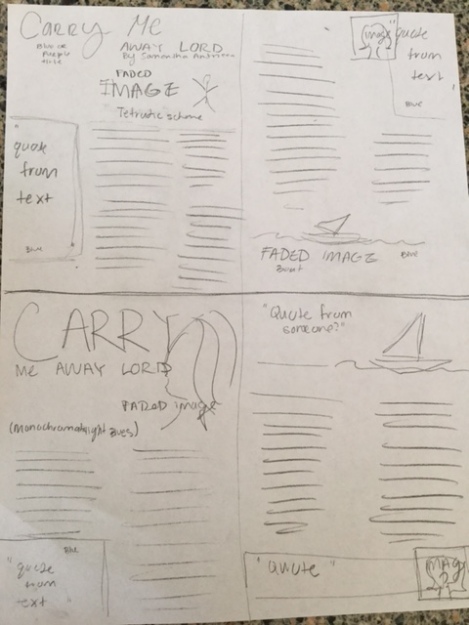
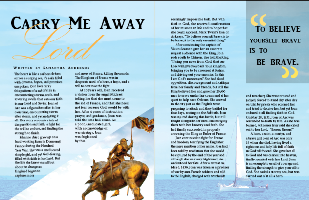
I really enjoyed working on this project this past week. I love to write so I had no problem finding a story that inspired me, and rewriting it into my own words. My message was focused towards more of a young daring women audience, as the heroine was Joan of Arc. I wanted them to understand how we can achieve anything we set our minds too as long as we trust in God. Because It’ll all be worth it in the end as He carries us away to our home above. Below is my story, sketches, and images I thought would work nicely with my story. Enjoy!

Story: Carry Me Away Lord: 

The heart is like unto a sailboat driven across a surging sea, it’s sails filled with dreams, hopes, and promises unspoken. Our lives carry this pattern of a sailor’s life in encountering storms, reefs, and towering swells that tests our faith in our Lord and Savior. Joan of Arc was a figurative sailor in her own time, encountering storm after storm, and yet enduring it all. Her story recounts a tale of desperation and faith, a fight for the will to endure, and finding the strength to finish.

Jehanne d’Arc grew up on a hard working farm in Domremy, France during the Hundred Year War. She was a uneducated simple girl, and yet God-fearing, filled with faith in her Lord. But the life she knew was all but about to change as England began to capture more and more of France, killing thousands. The Kingdom of France was in desperate need of a hero, a hope, and a will to continue the fight.

At 13 years old, Joan received a vision from the angel Michael telling her that she must come to the aid of France, and that she need not fear because God would be with her. After 4 years of instruction, prayer, and guidance, Joan was told the time had come. As a poor, uneducated girl, with no knowledge of war strategy, Joan was frightened by this seemingly impossible task. But with faith in God, she received confirmation of her mission in life and to hope that she could succeed. Mark Twain’s Joan of Ark says, “To believe yourself brave is to be brave; it is the only essential thing.”

After convincing the captain of Vaucouleurs to give her an escort to request audience with the King, Joan rode south to Chinon. She told the King, “I bring you news from God, that our Lord will give you back your kingdom, bringing you to be crowned at Reims, and driving out your enemies. In this I am God’s messenger.” She had faced opposition, discouragement and critique from her family and friends, but still the King believed her and gave her 20,000 men to serve under her command at her quest to help save Orleans. She arrived in the city just as the English were preparing to attack and they battled for four days, resting on the Sabbath. Joan was injured during this battle, but still fought alongside her men, encouraging them with her bravery and faith. She had finally succeeded in properly crowning the King as Ruler of France.

Joan continued to fight for France and freedom, terrifying the English at the mere mention of her name. Joan had been told by revelation that she would be captured by the end of the year and although she was very frightened, she understood her fate. After a retreat on May 6, 1430, Joan was taken as a prisoner of war by anti-French soldiers and sold to the English, charged with witchcraft and treachery. She was tortured and judged, forced to stand day after day on trial by priests who scorned her and tried to deceive her, but yet Joan endured it all, finding faith in God. On May 28, 1431, Joan of Arc was sentenced to death by fire. As she was burned, witnesses later said she cried out to her Lord,  “Jhesus, Jhesus!”

A hero, a saint, a martyr, and a brave girl, Joan of Arc was only 19 when she died, having lived a righteous and holy life full of faith in God till the end. She gave her all to God and was carried into heaven, finally reunited with her Lord. Joan is an example to us all of courage and finding the strength to give your all to God. She sailed a stormy sea, but was carried out of it all a hero.

Sketches:

IMG_0474

Images:

joan25 Joan651713-two-12-metre-sailboats

Image Links:

http://digipraim.com/data_images/out/21/651713-two-12-metre-sailboats.jpg

https://travelmonkeydotme.files.wordpress.com/2013/08/img_0040.jpg

https://img1.etsystatic.com/000/1/5124363/il_570xN.270419481.jpg

Slide Design Project

Speaker Outine:                                                                                                                       TED Talk: Simon Sinek: How Great Leaders Inspire Action (Sep 2009):

  1. Why do some leaders succeed and others fail?                                                                     – How do Leaders among us achieve greatness?
  2. Golden Circle                                                                                                                                     – WHY are you doing this?                                                                                             – HOW  are you going to complete your plan?                                                           – WHAT  is your organisation selling?
  3. Inside Out                                                                                                                                       – Communicate with the WHY/ Create an Idea                                                       – People buy WHY you do it, they don’t by WHAT you do.
  4. Believe What You Believe                                                                                                         – Inspire others
  5. Link Together                                                                                                                                     – Harmonizing a goal as an organisation, Uniting in Dreams.

Process: 

I wanted to do a TED talk on leadership and how it brings people together from the start. Leadership education is a very important topic for me as I love getting motivated and inspired by presenters, and love helping other youth find their inner leader. After creating an outline of the speakers points I looked up pictures relating to the message I wanted in each slide. The pictures I choose needed to reflect quality and professionalism in my slide show so I made sure to  choose large pictures.  Then I created sketches (below) of the basic ideas I wanted and obviously changed it a lot later to fit the critiques. I then put it together on power point!

Sketch
Sketch

Critique: 

I got a few critiques on Facebook from Chris Betts and Shay Sookhoo pointing out a few errors I had missed.They mostly corrected my mistakes in alignment and a extra font I had overlooked. I also got my slides critiques by Sister Peterson who advised me to fix my typography into a more consistent type and to fix some pixelated pictures.

Link to Talk:  https://www.ted.com/talks/simon_sinek_how_great_leaders_inspire_action#t-457809

Fonts: Century Gothic ( sans serif) , AR BERKLEY ( script).


Event Flier

Samantha_Anderson
Flier ^^
Windowspic
Windows^^

Process: When I first read about this project my mind went completely blank with ideas. It took me quite a few internet searches to find events in my area that finally sparked a little interest and enthusiasm for making this flyer. Since I love running, the idea of doing a flyer on a race came too mind and I googled race fundraisers in New Mexico… finally finding this cancer walk that is raising money for cancer research. This topic is such a touchy and emotional subject and I wanted to try to express that feeling in the flier. I knew I wanted a picture of a little girl on the flier and was overjoyed when I found this sweet girl.  After adding the title, information, and logo in the text boxes, I still felt like I was missing something in the flier, which later inspired the words in the bottom left corner, “Walk. Run. Fight childhood cancer.” I then posted it on Facebook and to Sister Peterson for critiques, took some of their advice, and then submitted the final project!

Critiques:  I posted the first draft on Facebook and was delighted to receive comments from Christina Carrick, Jacyln Stephens, and April Bethea. They mostly suggested that I put the word “fight” up beside the “Walk. Run.” where previously it had been lower with “childhood cancer”. They also suggested I remove the colored box I had around the title to help it stand out more, and keep in mind the margins. Sister Peterson’s critique suggested that I move the title and date box over to get rid of the trapped white space in the middle. I also changed the title to match the key words on the bottom left side.

Fonts: Title/Key Words: Eras Light ITC. Website: Lucida Calligraphy.

Links:  St. Jude website and logo: http://fundraising.stjude.org/site/TR/Walk/Walk?pg=informational&fr_id=57385&type=fr_informational&sid=11735:

Picture of girl: https://www.firstgiving.com/imaging/stock/bde247ee-842d-41af-b2ce-4b1363a357c9.jpg